The Design of the Emacs Logo: Part II

Part II: Four Letters and Some Lines
The odyssey begins like this...
When autumn crept up in '94, Lars Magne Ingebrigtsen grew bored and decided to rewrite Gnus.I think it was Lars' personality that convinced me to join the ding mailing list (Gnus was initially called "ding" (ding is not Gnus)). I recall having a discussion with him, on the merits of infinite customizability and was quite impressed with his comments (I searched Google for this discussion, to no avail. Perhaps it was an email exchange; I'll have to check my email archives).
My initial interest in joining the list, was so I could suggest new features, or rather, features I wished to see in a newsreader. I would be useless as a contributor of code0. When the opportunity presented itself, contributing a splash-logo was the least I could do to pay-off my debt to all those people who contributed to GNU Emacs.
The conception
Note: I can't find the original email messages I sent Larsi (I don't even remember if I archived them)-- I only kept his replies. So in the email exchanges that follow, my original email is cited in the body of his replies.
From: Lars Magne Ingebrigtsen
To: Luis Fernandes
Subject: Re: Toolbar & stuff
Date: Fri, 7 Jul 95 12:31:37 +0200

Luis Fernandes writes:

>     > It would be great to have some designer-type person create a
>     > Gnus logo and a toolbar... If anybody would like to volunteer,
>     > pipe up, please.
>
> Oh! Oh! Me! Me!
The requirements
From: Lars Magne Ingebrigtsen
To: Luis Fernandes
Subject: Re: Toolbar & stuff
Date: Sat, 8 Jul 95 19:31:52 +0200

(Luis Fernandes) writes:

> For the splash screen (I assume this is to keep the user occupied
> while gnus-cache loads :-) I was thinking something along the lines
> of a gnu on a surfboard flying out of the screen towards the user
> through the '0' in "Gnus 5.0"...

:-)

(ding) Gnus is going to be called just "Gnus". Version numbers are
verboten, I've been told.

I'd like to have a logo I could basically slap on anything. A big one
on the splash screen and on the front of the (paper) manual, a tiny
one on the mode line and perhaps a small one strewn all over the paper
manual. Not to speak of the t-shirt and the official Gnus car. :-)

I was imagining something Vaughan Oliveresque. Or someting.

Of course, there could be something in addition to the word "Gnus" on
the splash screen - the logo set in a meadow?
The design process
The following excerpts of email exchanges between Larsi and myself should provide a good idea of how we agreed on what he had in mind for the Gnus logo.
I thought that the initial design process would be fraught with difficulties and frustrations because it would be carried out entirely via email. As any designer will tell you, face-to-face meetings are preferable in situations where abstract ideas are discussed. With Lars being in Geneva at that time, and I being in Toronto, even a single face-to-face meeting would be out of the question. So the only way I could design a logo he liked, would be to ask a lot of questions and hope that one of his answers would inspire me.
From: Lars Magne Ingebrigtsen
To: Luis Fernandes
Subject: Re: Toolbar & stuff
Date: Mon, 10 Jul 95 20:34:59 +0200

(Luis Fernandes) writes:

> Hmm...OK, how about putting the surfin' gnu logo as an easter egg
> that only shows-up on April 1st :-)

:-)

> I've been working on some concepts from which the logo would
> ultimately be based on:
>
> 	- a person (I was thinking more of a monk, but this could offend)
> 	  sitting at a window writing in a book (sort of "ancient
> 	  lithographed engraving" type look)
>
> 	- the Tower of Babel (personifies that 90% of Usenet posts are
> 	  crap) (this maybe too political, and I have no idea what the
> 	  Tower looks like...)

How about the tower of Piza with a sign saying "Babel". :-)

> 	- something along the O'Reilley books:
> 		- if Gnus was an animal, what would it be?

A gnu?

> 		- if Gnus was an bird, what would it be?

A turkey. :-) Or, what's-it-called, that black-and-white bird that
sounds like a crow. When it chirps.

> 		- if Gnus was an insect, what would it be? --(I think, a bee)

A preying mantis.

Or if Gnus was a piece of furniture, what would it be? A rococco
chair. Hey, I kinda like that image.

> 	- a montage of images illustrating different modes of
> 	  communication: carrier pigeon, posted letter, book, telegraph,
> 	  Morse code, etc.

That's sounds a bit too elborate, I think...

> Maybe the bee (if that catches your fancy), or a ship's bell (ding!)
> like those that are rung to indicate the change of a watch (it would
> be nice to have something of dgnus ancestry peek through as an
> in-joke)...

An alarm clock? The old-fashioned kind? "Brrrring! Time to wake up to
a New Reality!"

>     > I was imagining something Vaughan Oliveresque. Or someting.
>
> My home library tells me of a Andrew Oliver (American politician);
> Isaac Oliver (English painter, perhaps you mean him (he painted a
> portrait of Ann of Denmark)); and a Sir Lawrence Kerr Oliver (English
> actor and director); but no Vaughan...have to go look this up...

No, actually, Vaugh Oliver has done lots of book jackets and album
sleeves (mostly for 4AD). Have a peek at
"http://www.ifi.uio.no/~larsi/eyesore.html". Logos-a-gogo.

> Well, naturally, just word "Gnus" would be just as boring (if not
> more so) as having just the word "Xemacs"...

Well, one can do a lot with four letters and some lines... Some
constructivist/futurist (in the old sense) kinda thingie...
Version 1.0
As in Part I, the scans, below, are from my sketchbook. I plan on scanning some more of the pages (if I can find them), to show the progression of the development process.
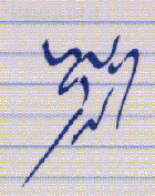
 The first prototype: A gnu created with the letters "G", "N", "U" and "S" (18Jul1995)1. |
The following day, I read his reply...
In retrospect, I'm quite surprised how smoothly the design process went.From: Lars Magne Ingebrigtsen To: Luis Fernandes Subject: Re: Logos: prelminary sketches Date: Wed, 19 Jul 95 18:04:02 +0200 Luis Fernandes writes: > Based on the following suggestions... > > >> - something along the O'Reilley books: - if Gnus was an > >> animal, what would it be? > > > A gnu? > > > Well, one can do a lot with four letters and some lines... Some > > constructivist/futurist (in the old sense) kinda thingie... > > ...I humbly submit a series of images....to follow in individual > mail. Wowsie. You're good! My initial reactions to the image: "Hm. It's a sort of flying Japanese lines sorta things. No, wait, there's two breasts. No, wait, there's an "n" down there, perhaps those are letters? No, breasts. No, wait... an animal... It's a gnu!" And then I couldn't un-see the gnu. Brilliant! (I didn't know that gnus looked like mooses (meese?) though. :-) Perhaps we should change the name? Moose. Has a certain ring. :-) > Some notes: > > - I showed it around (to some engineers) and NO ONE "got it". > > - I want it to be subtle; but not too subtle. > > - So, the deeper you look, the more you will see. Yup. I think very few people will get it, but that's not a bad thing, though. People will look at the thing, then read the work "Gnus", then look at the thing, and so an, until it'll hits them like a ten ton truck. > gnus4.rf is a series suitable for chapter beginning/ends and for > sprinking around the doc... Hey, those small gnu heads (without the body) are cute. We'll have a real stampede throughout the manual! :-) > ...eagerly awaiting your comments... I hope I don't seem like a total pushover here, but I *really* like what you've done here.
Refinements
Further refinements made the logo look more like an animal then the recursive personification of 4 letters and some lines. It made the origins of the logo even more subtle. Everything was hidden in plain sight-- if you knew where to look.
 The "U" of the horns was modified to resemble those of a gnu rather than a water-buffalo (27Jul1995). |
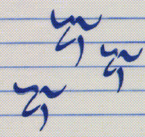 Just gnu heads: the center image was used in the Emacs mode-line and sprinkled throughout the Gnus manual (27Jul1995)2. |
I combined those 3 letters, "GNU", to form just the head of the gnu. When the gnu is viewed in its entirety, those 3 letters again appear in different places; the logo is just as recursive as the acronym.
The birth announcement3
To: ding mailing list
Subject: Logo on startup
From: Lars Magne Ingebrigtsen
Date: 14 Dec 1995 11:20:58 +0100
Organization: Dept. of Informatics, University of Oslo, Norway

XEmacs users will be shocked & amazed with September 0.22 (if they
get and install the new etc-0.2.tar.gz package) -- I've finally
included the logo on the splash screen.  This is the early draft of
the logo, but I thought y'all would like to see it for a
while... It's a bit longish, though.  :-)
The official logo
A few revisions later, I sent Lars this version which became the official Gnus logo.
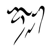 Final revision: sleeker and more subtle than the original (10Aug1995). |
                           _    ___ _             _
                           _ ___ __ ___  __    _ ___
                           __   _     ___    __  ___
                               _           ___     _
                              _  _ __             _
                              ___   __            _
                                    __           _
                                     _      _   _
                                    _      _    _
                                       _  _    _
                                   __  ___
                                  _   _ _     _
                                 _   _
                               _    _
                              _    _
                             _
                           __
ASCII
version of the logo. Created by passing a GIF version of the logo
through
gif2ascii and then hand-tweaking the
results. To help decide on best character, Lars wrote a LISP program
that rendered the logo in all the possible ASCII characters-- we
settled on the underscore.
|
The bitmap image was converted into a vector format and further converted to Postscript and used for the T-shirts, mugs, etc.
[Update, Jun 10 2003: Oort Gnus T-shirts]
Part III continues where part I left off.
0 My experience with Emacs LISP was (and still is) limited to cutting and pasting snippets of LISP posted to Usenet, into my .emacs or, as the site maintainer for Emacs, downloading and compiling the latest Emacs, and the contributed .el files and installing them into site-lisp.
1 This image was used on the back of the commemorative Gnus T-shirts.
2 The gnu head, when viewed independently from the body, is formed with the letters: "G", "N" and "U".
3 Incidently, my nephew was also born on December 14, 2001.